GETTING OUT FROM THE COMMON GROUND
In 2024, I decided to join my first so-called "international logo competition" that are held by Chinese Government Embassy in Jakarta. This annual events are followed by both Chinese and Indonesian participants. After researching a bit from previous winners, the logo had shared personalities which are showcasing their national symbol (Pandas and Garuda) from each corresponding country. The common ground, it also uses the same Gold Color to symbolizes their harmonious relationship throughout the years.

But as I'm wanting to make logo that are different but still contain the meaning behind the two country, representing their 75 years of relationship. After some initial concept and idea, I have the idea of "Shared Unity" being able to represent each country but shaped as one entity - with that said it can't be separated and only together is a powerful logo.
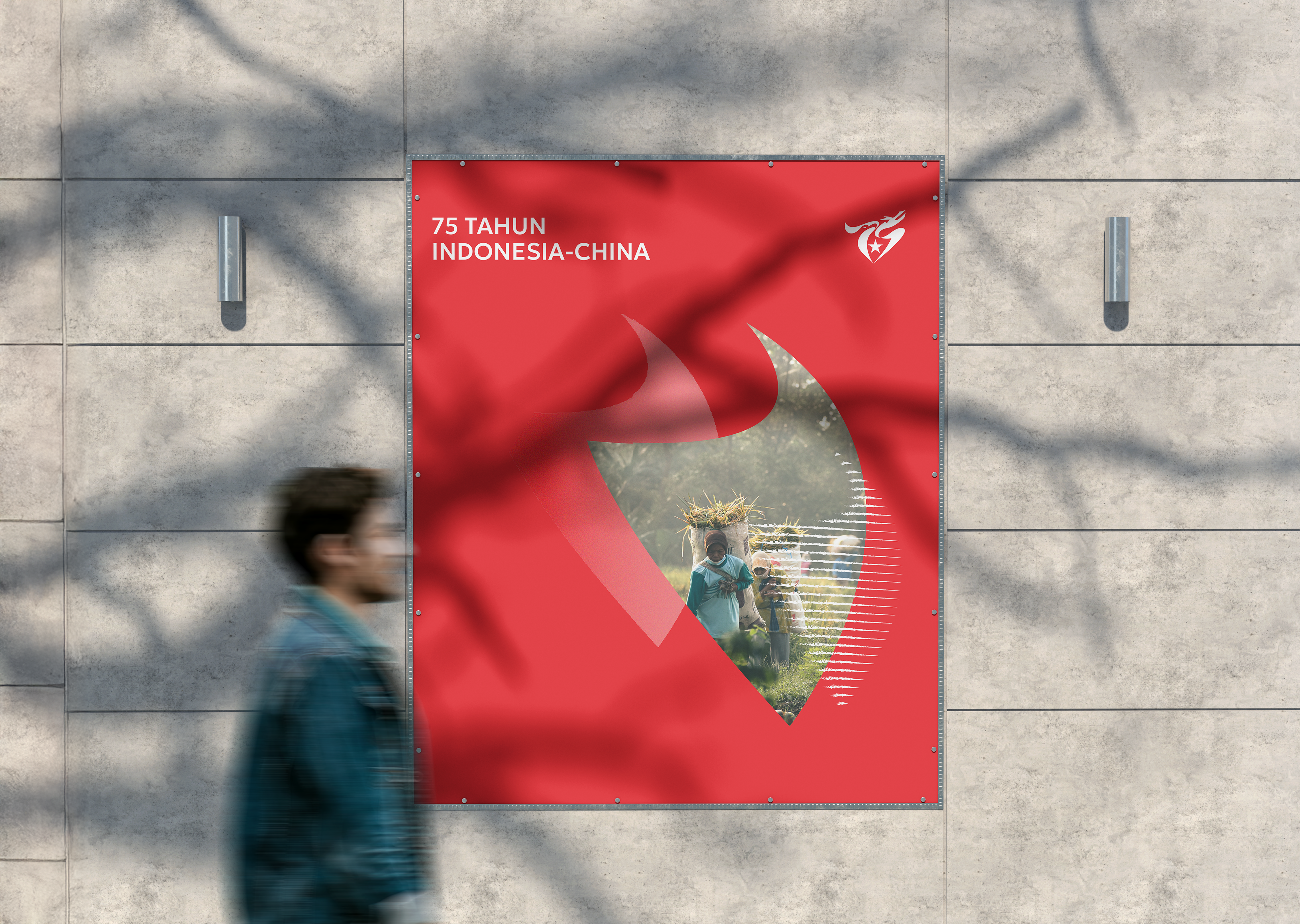
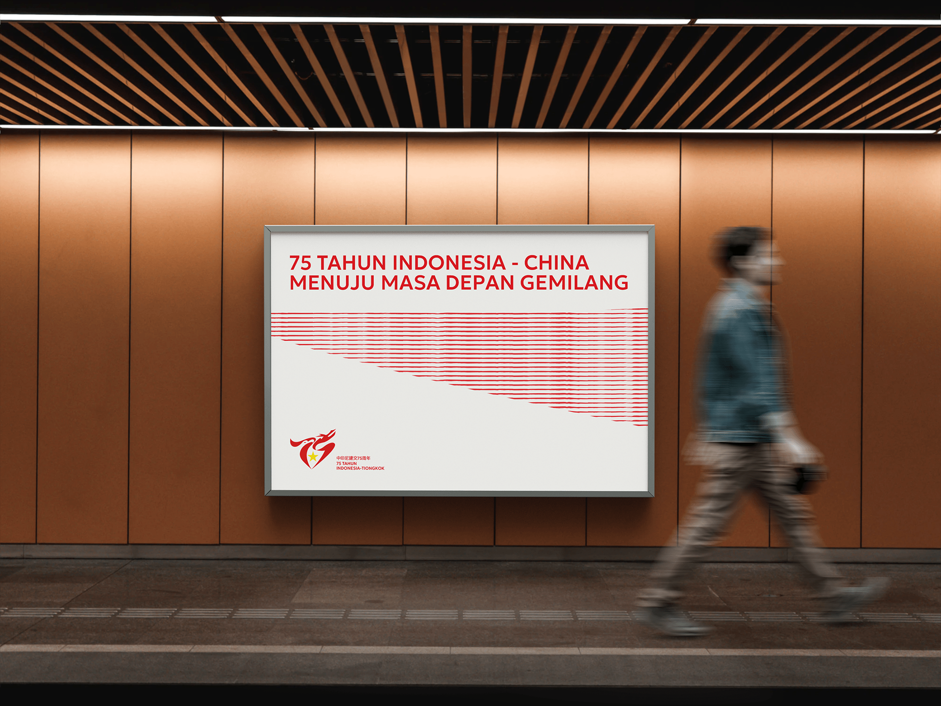
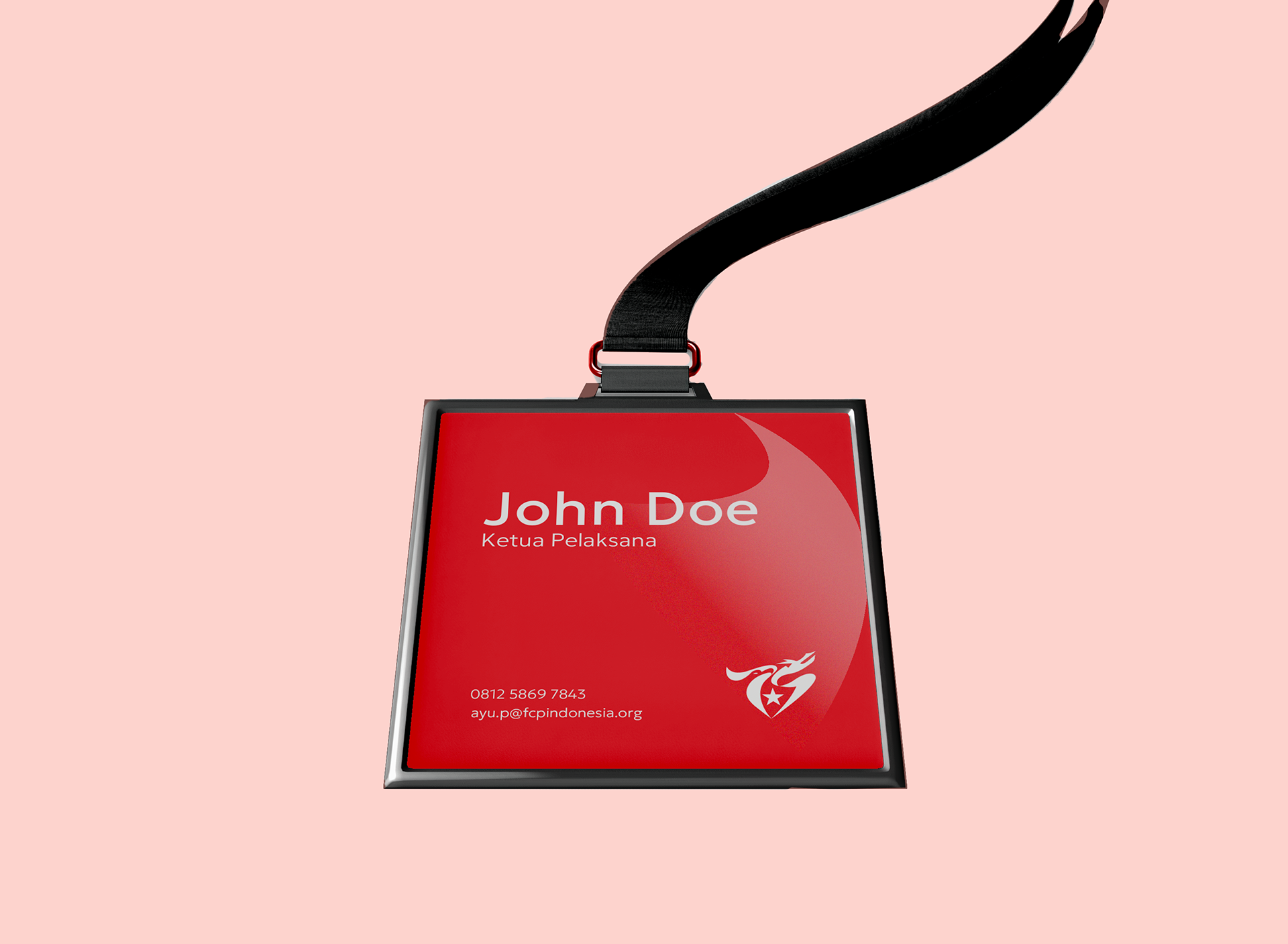
With the mission of commemorating the 75th anniversary of diplomatic relations between Indonesia and China, the logo further emphasizes its friendships ties. The wordmark logo "75" marks their anniversary year, hence forming whole as a dragon, symbolizing prosperity, strength, and shared unity between two countries. Between number 7 and 5, inside negative space a shield is formed that signifies Indonesia’s foundational values of Pancasila, adjascent is a big star symbolizes Communist Party of China.
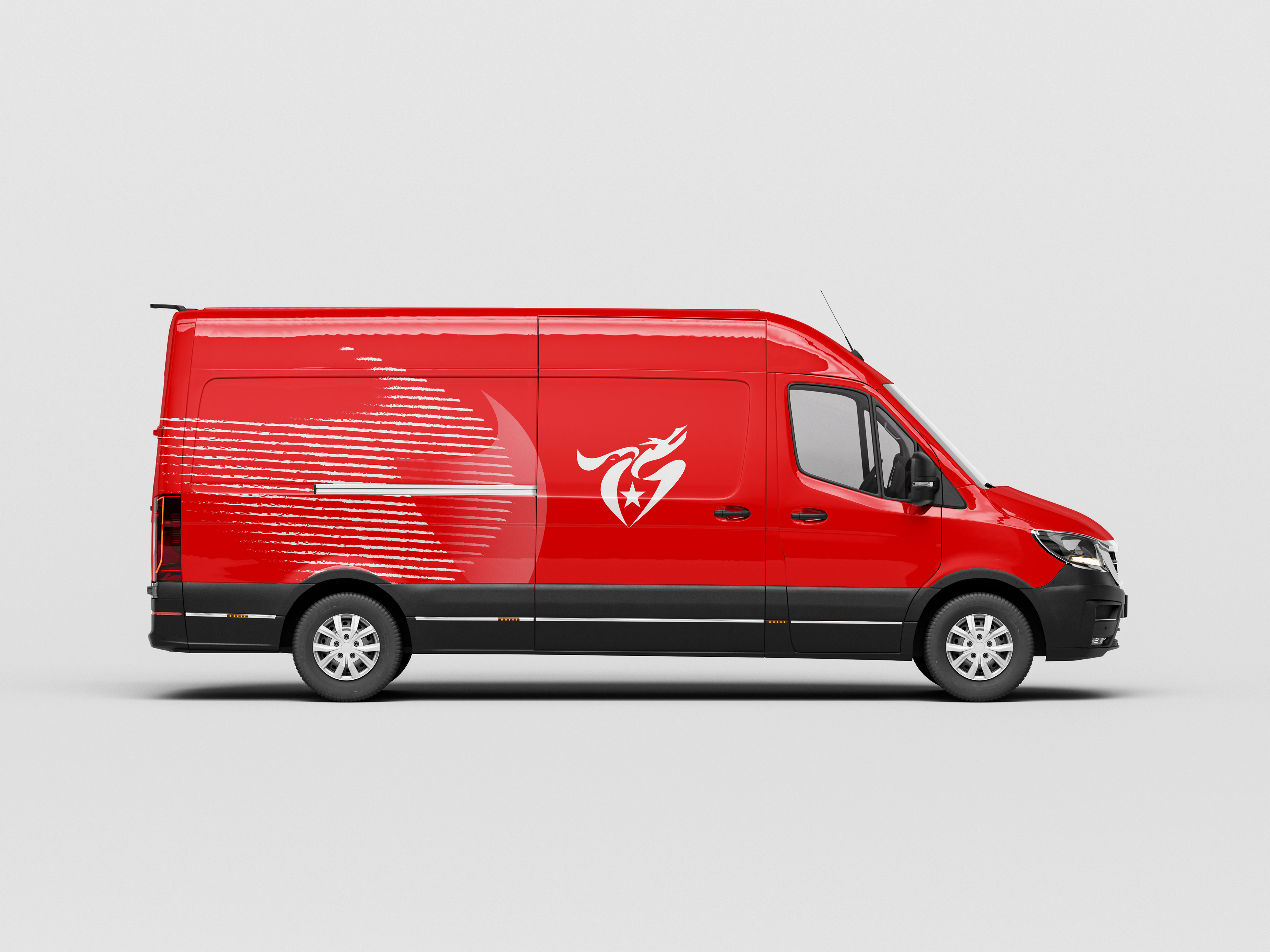
Next are color pallete that are carefully chosen to reflect and embodies their shared values. With color red represents fire element, symbolizing prosperous growth, while yellow reflects warmth of sunlight symbolizing their harmonious relationships throughout the years. The dragon’s eye forming ascending arrow signifying growth within two countries.
Not just a symbol, this logo signifies enduring partnership between the two countries, incorporating curved-sharp edges emphasizing their adaptability on achieving clear defined goals as both continue to strengthen ties for the future.
Not just a symbol, this logo signifies enduring partnership between the two countries, incorporating curved-sharp edges emphasizing their adaptability on achieving clear defined goals as both continue to strengthen ties for the future.