A SANCTUARY FOR ACAI LOVERS
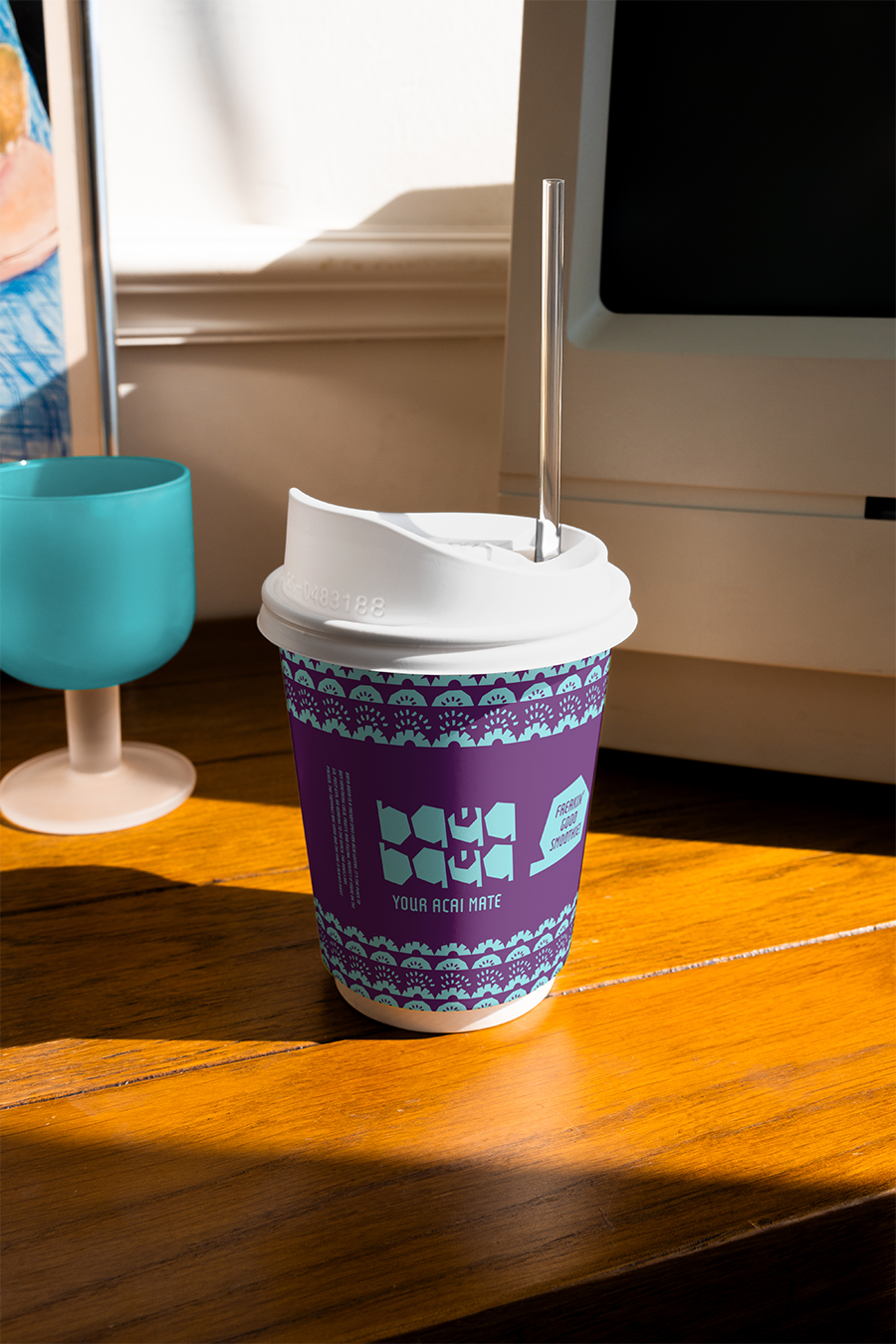
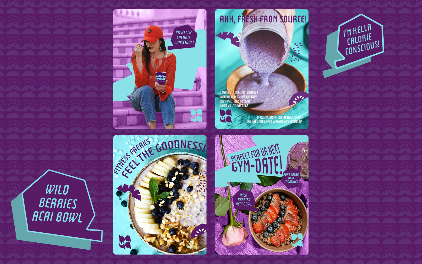
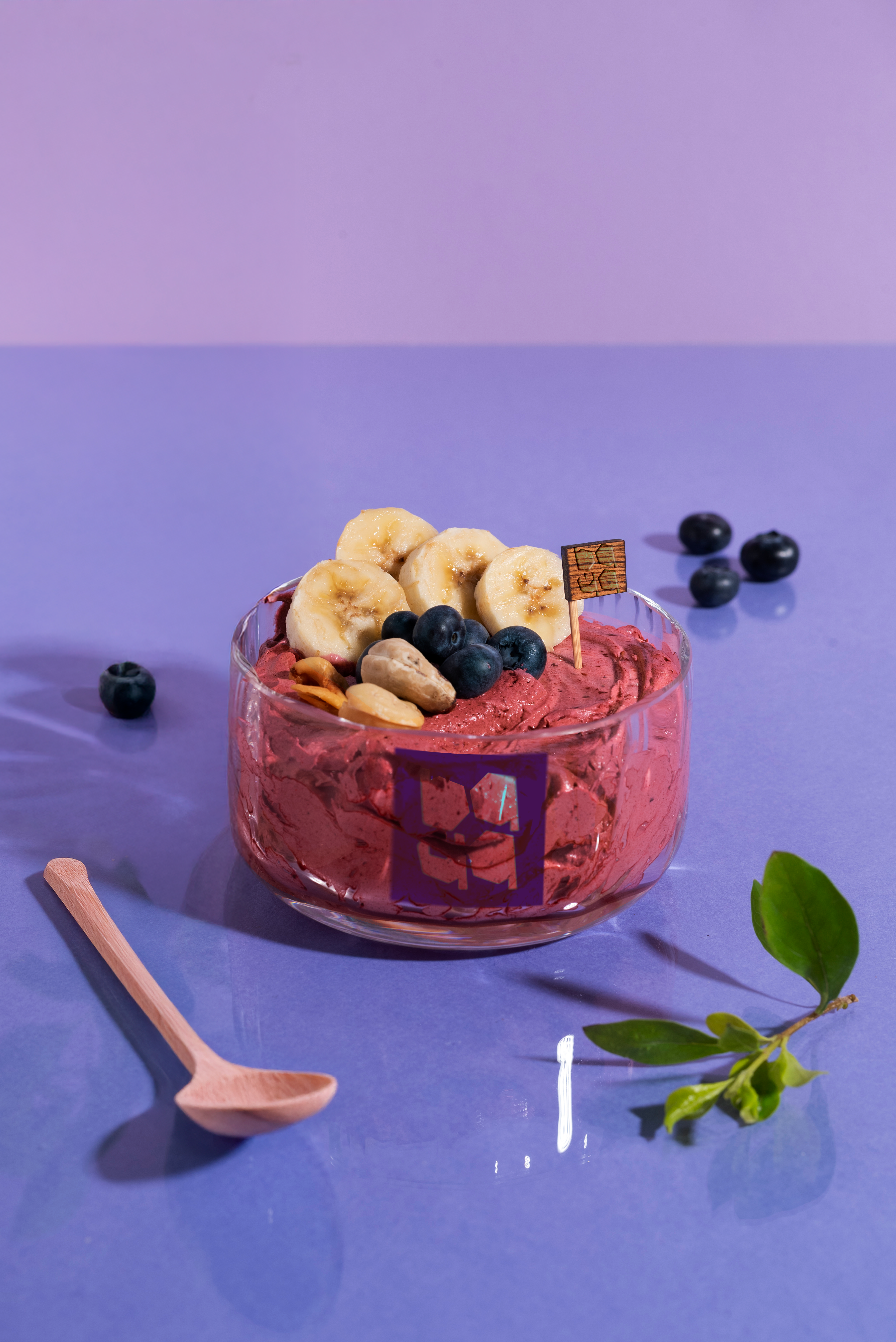
Baya Baya is a trendy spot for Açaí lovers. It's the place to buy something cold, fruity, and fillingthe . Perfect if you're on the go, post-gym, or heading to the beach. The bowls are packed, the toppings are good and and the vibes are always right.
With emerging markets of healthy dessert with various choice, came with its own unique challenges - being both trendy and natural concurrently preserving authenticity. Baya-Baya came out as solution-maker, a top choice for health-conscious youth - packed with full toppings yet staying fresh with its commitment on eco-friendliness. Using pure Açaí that is reflected on pure, organic, and natural forms on every elements.
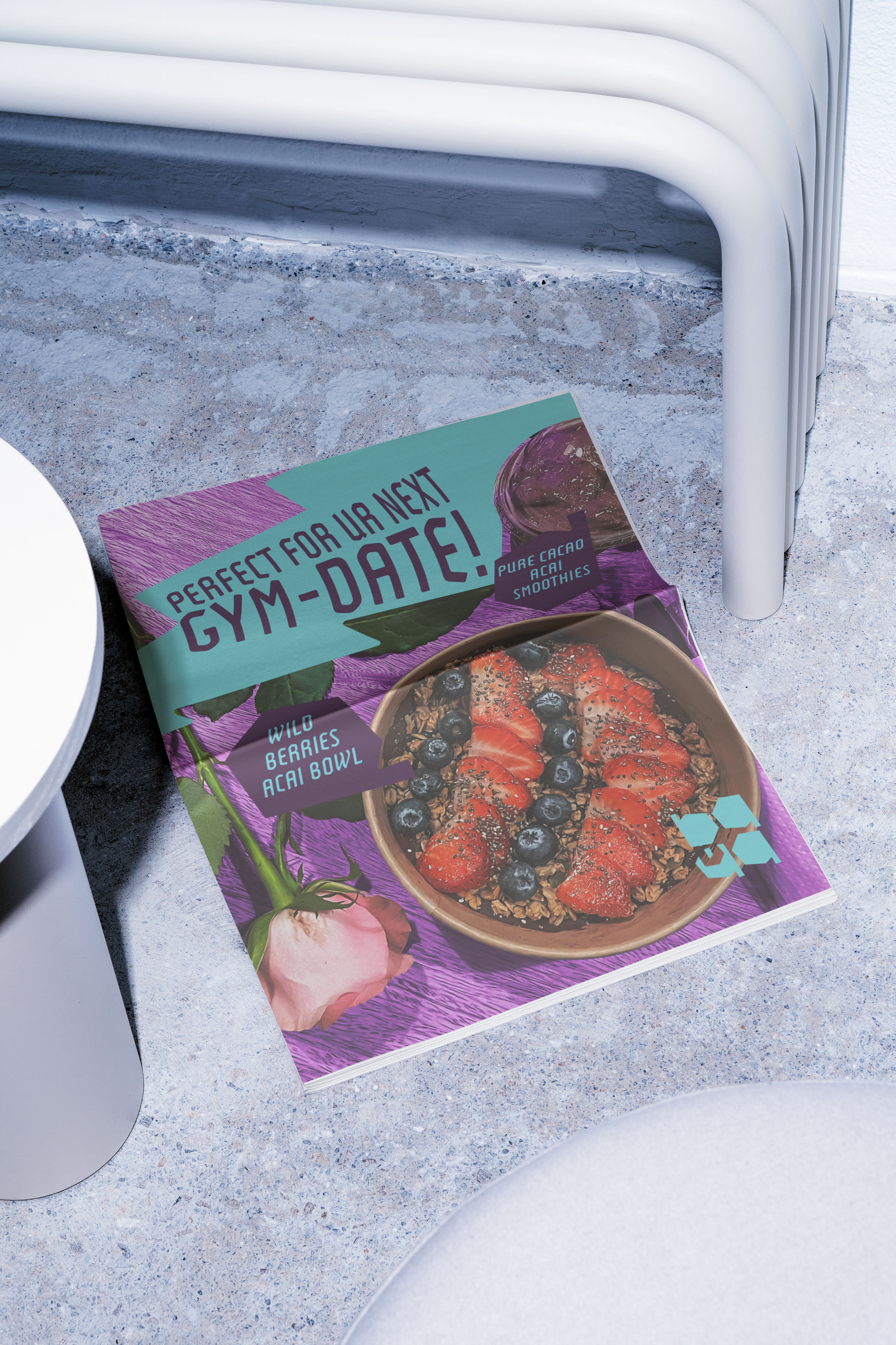
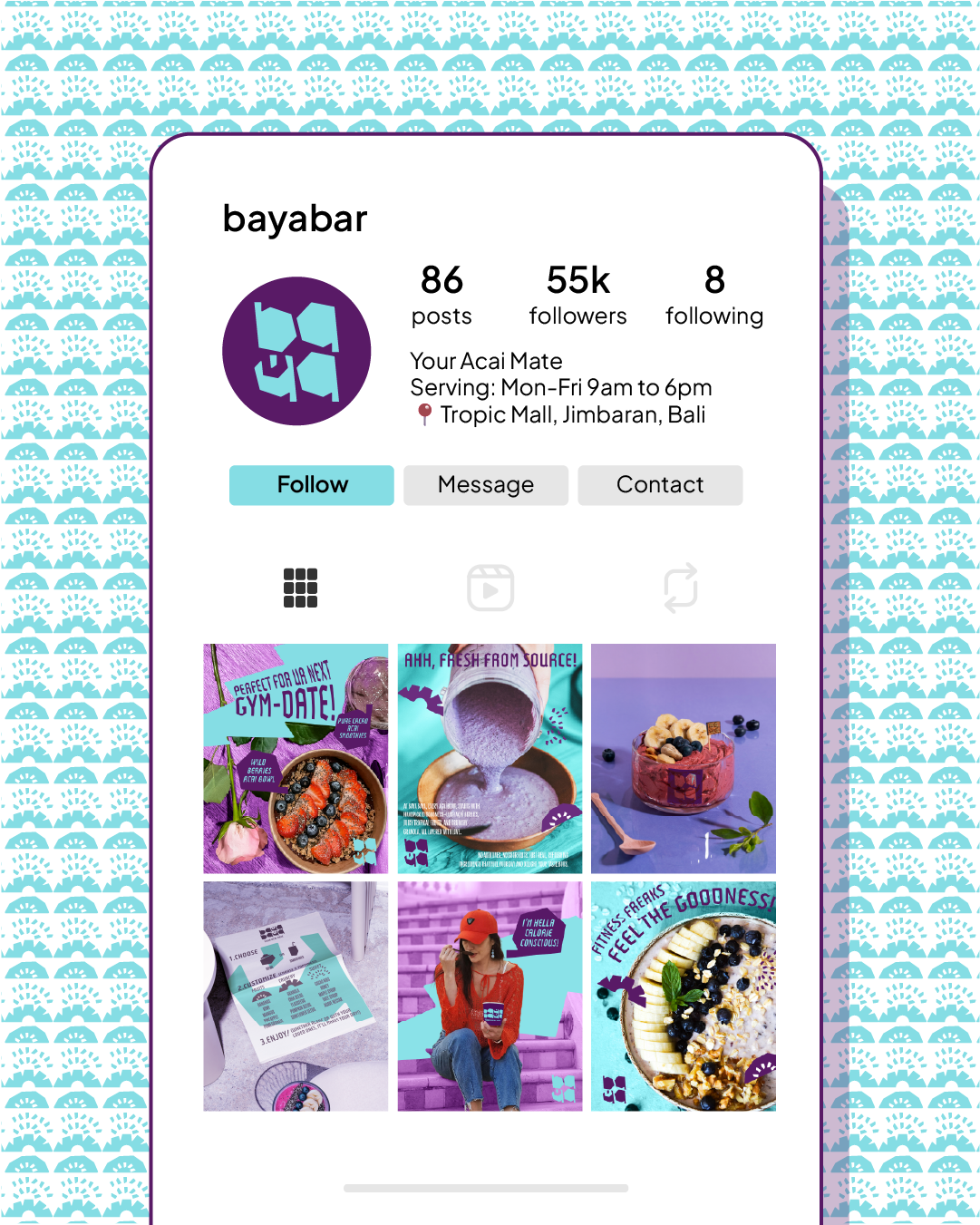
Using witty and playful brand voice throughout its identity, it invites younger generation as the main target audiences. Moreover, modern trendy slangs seen across multiple platforms, from poster to social media posts, enabling Baya-Baya relate to its desired audiences more effective and efficient.

ALWAYS FRESH FROM THE SOURCE
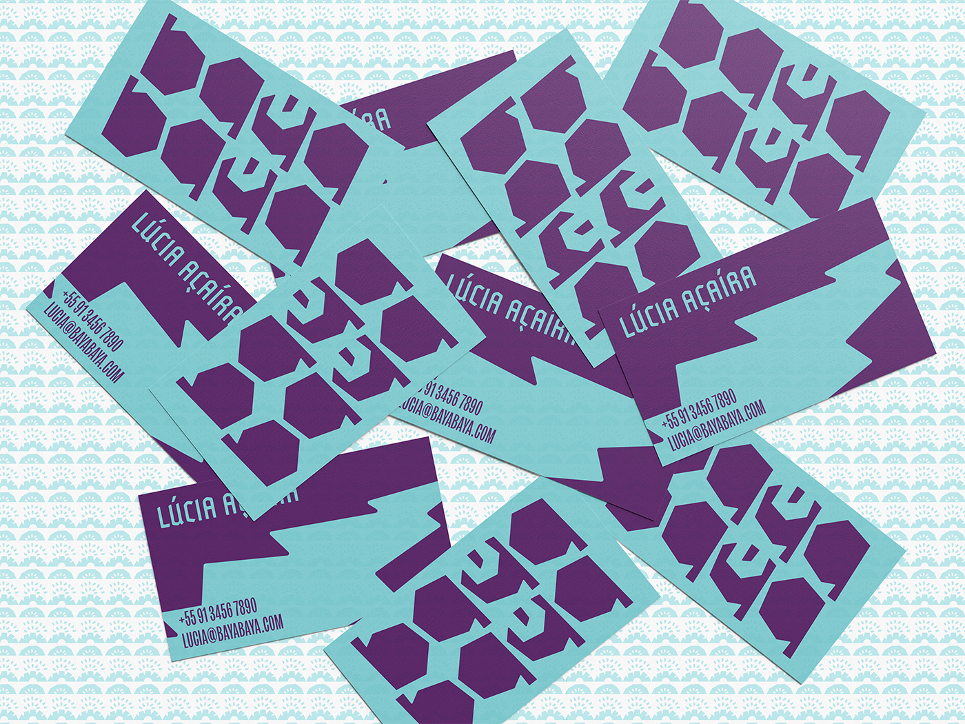
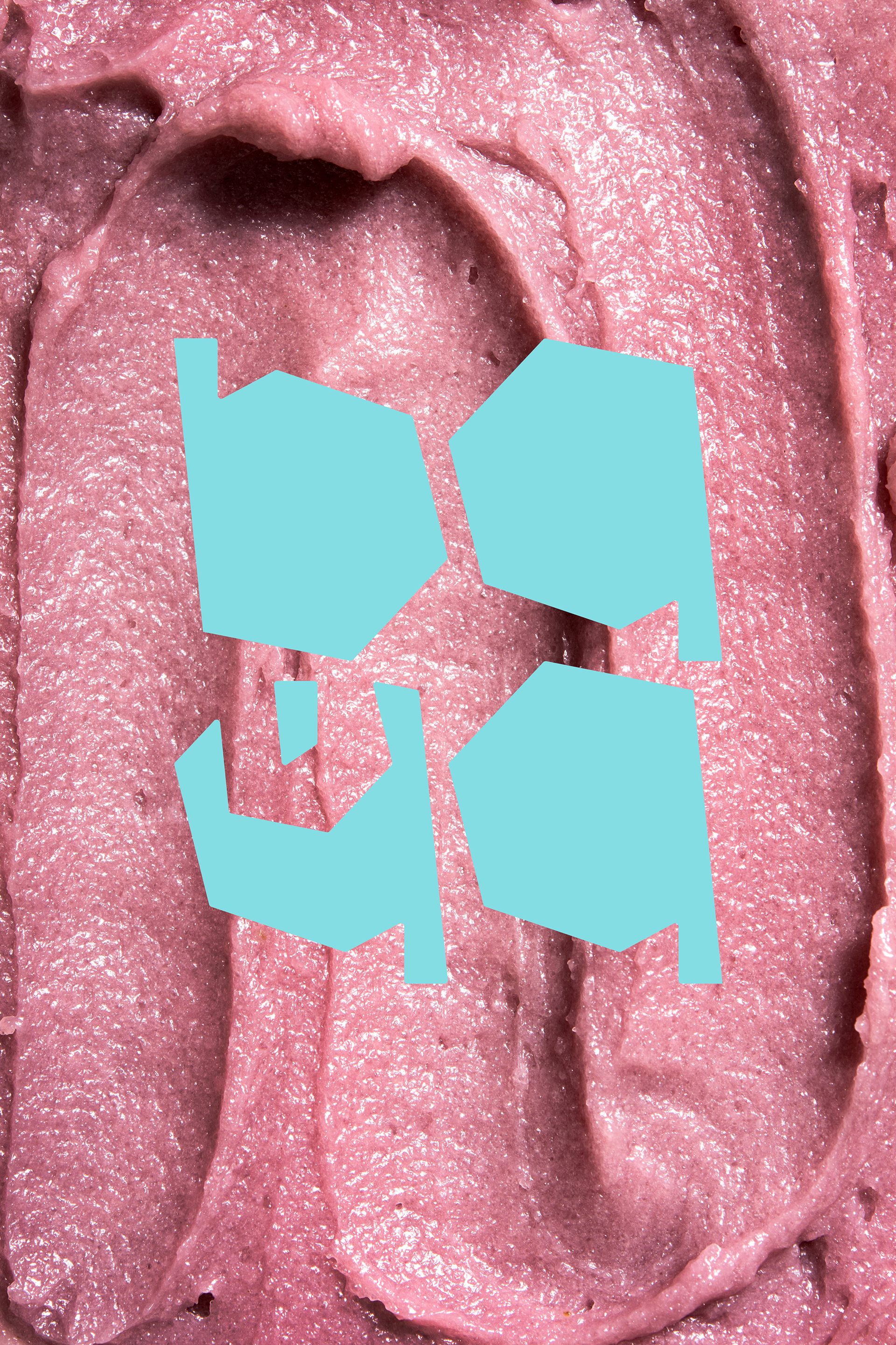
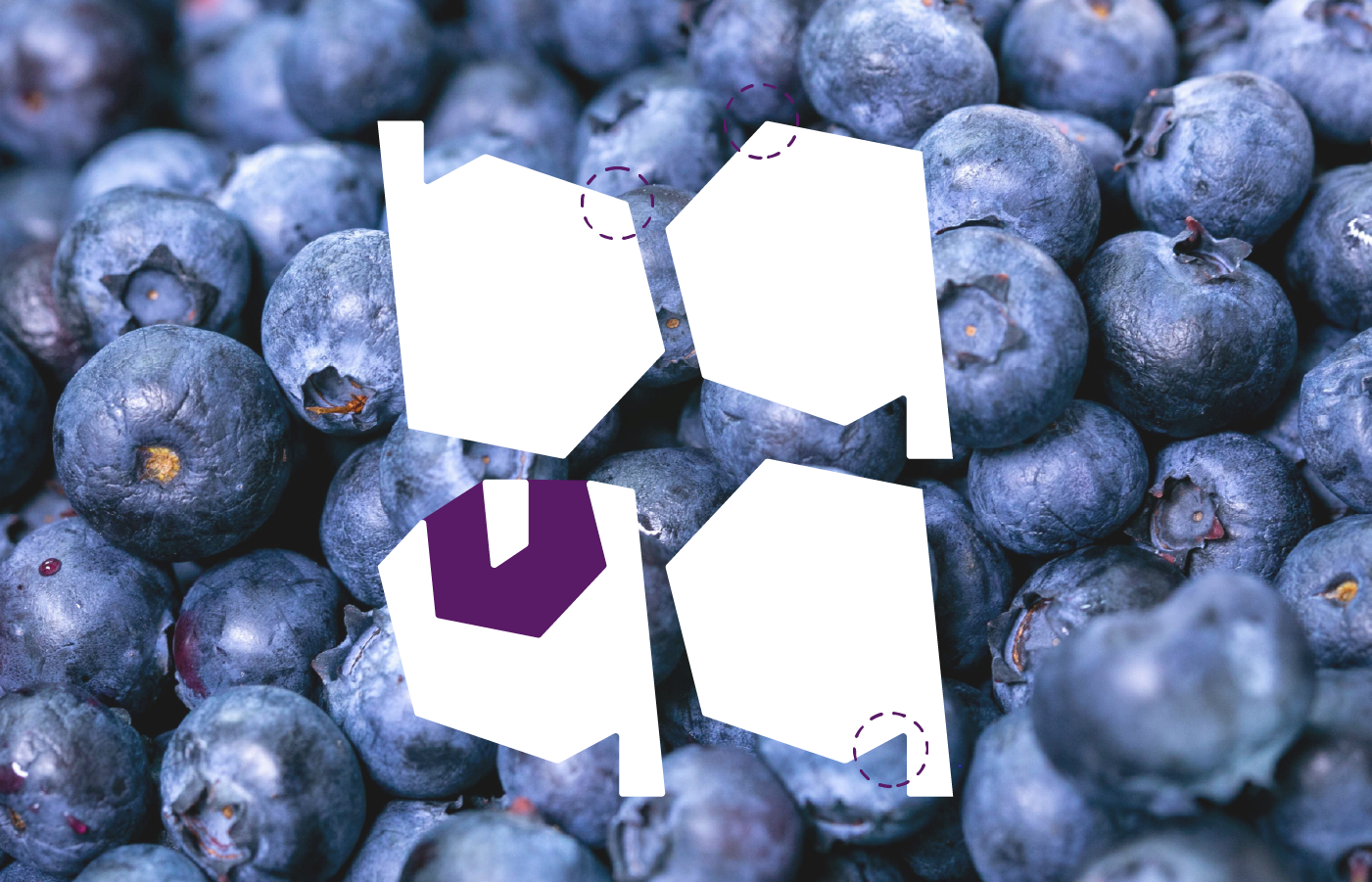
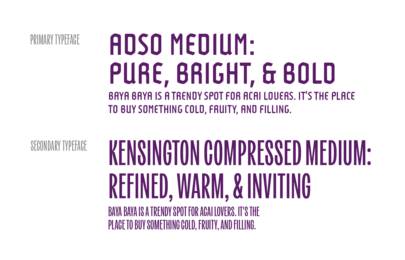
To set apart from its competitors, Baya-Baya uses custom hand-crafted logotype, it highlights the infused organic ingredients. The letter Y's negative space contains Açaí Bowl main ingredients, the Açaí Berry - embracing purity through boldness, with its non-geometrical forms. Moreover, Adso - a main font that mimics Açaí purée imperfection, accompanied wih Kensington Compressed, a modern sans-serifs that warmly invites younger audience, being fun and informal - more legible when placed on menus or lists.
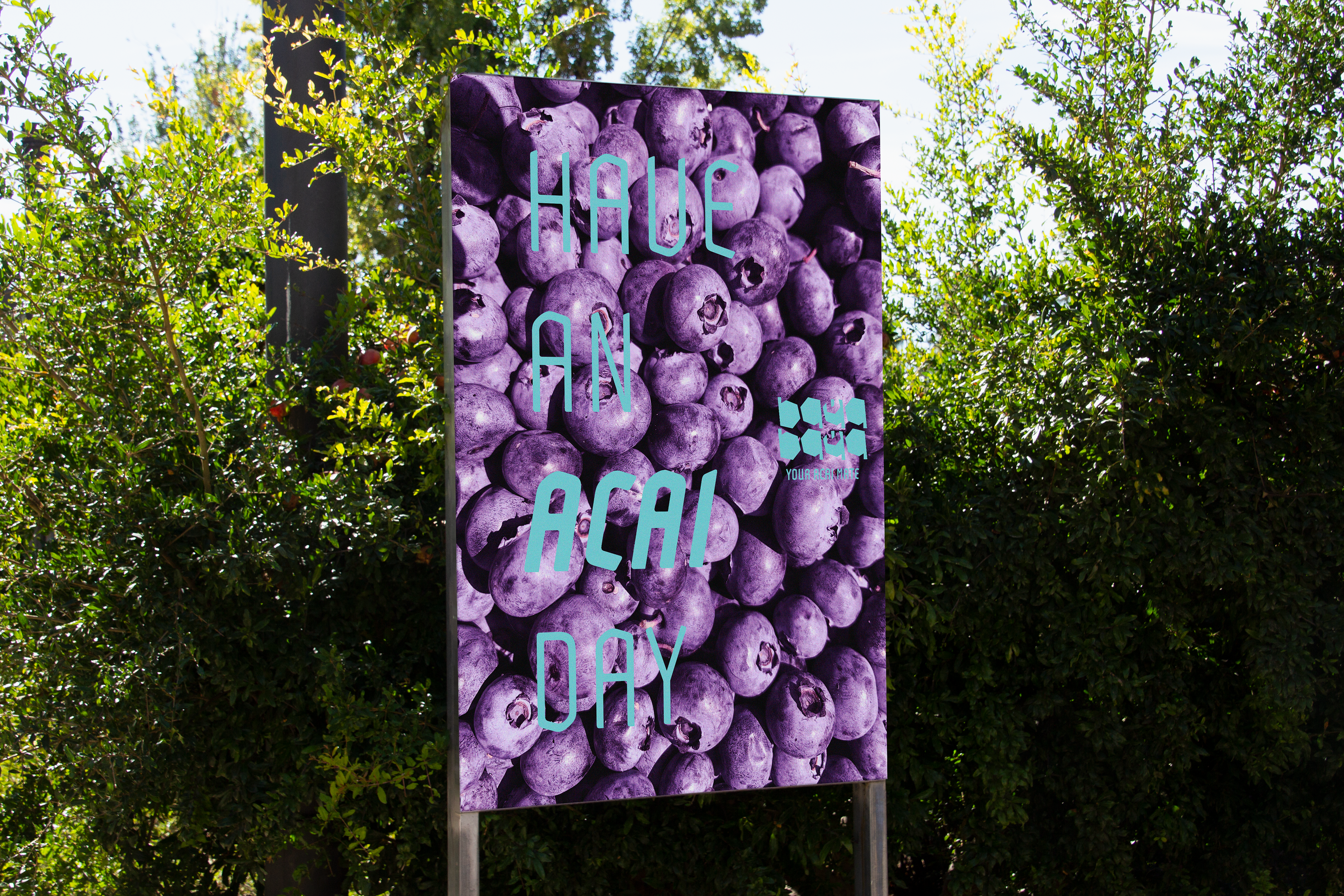
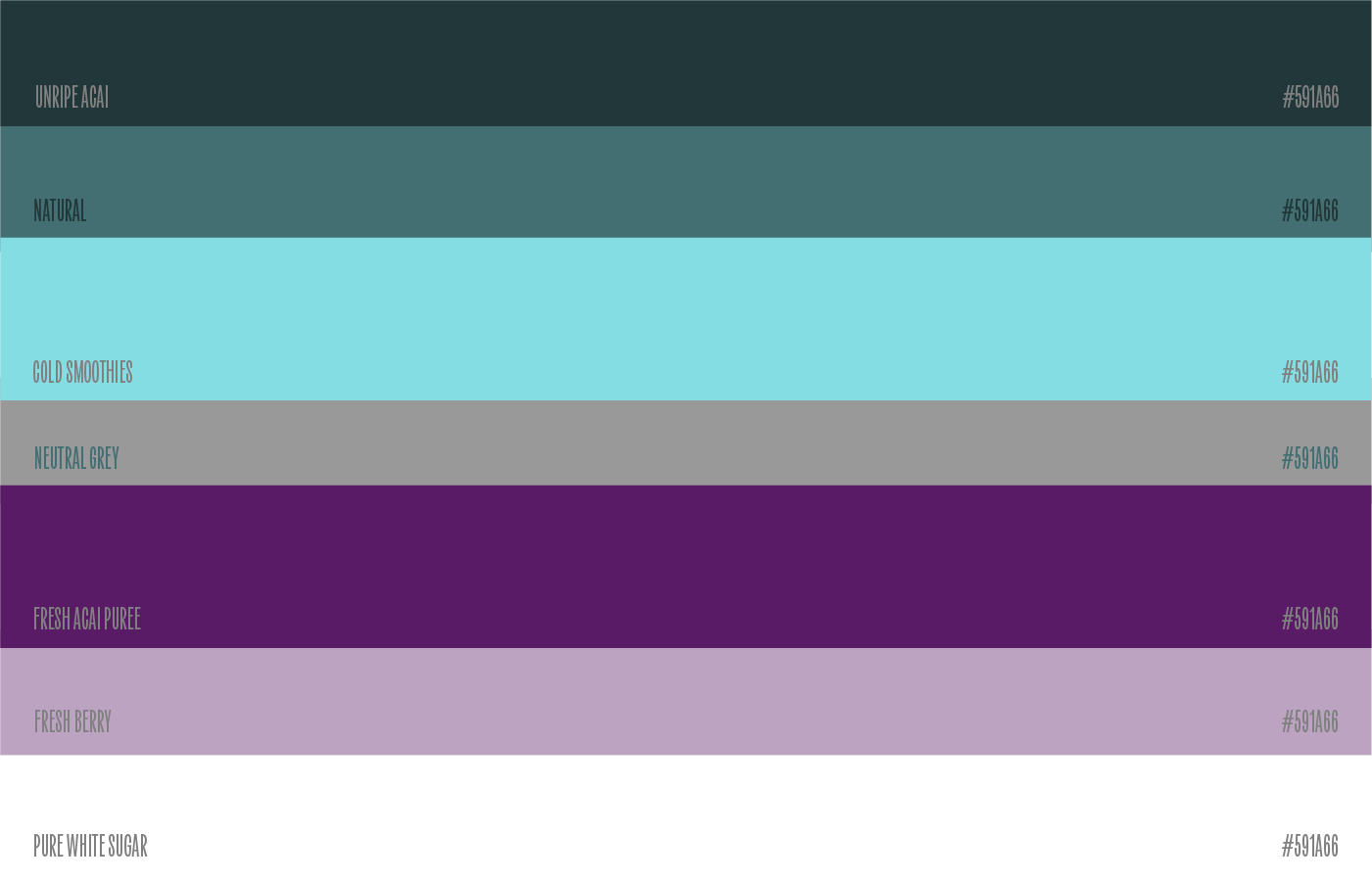
Then, color palletes are derived from the pureness and natural aspects of ingredients, further highlighting its commitment of staying fresh. Utilizing only two conrasting primary, are adequate to make the brand feel alive, and stay fresh. Whilst both name and tones inspiration are taken from specific ingredients of each bowl - making it precious, unique, and driven with intention on every choice. Packed with full handful toppings, it is a go-to place to chill and hangout with your friends on a hot sunny day.

MINDFUL CHOICE FOR THE GUT CONSCIOUS'
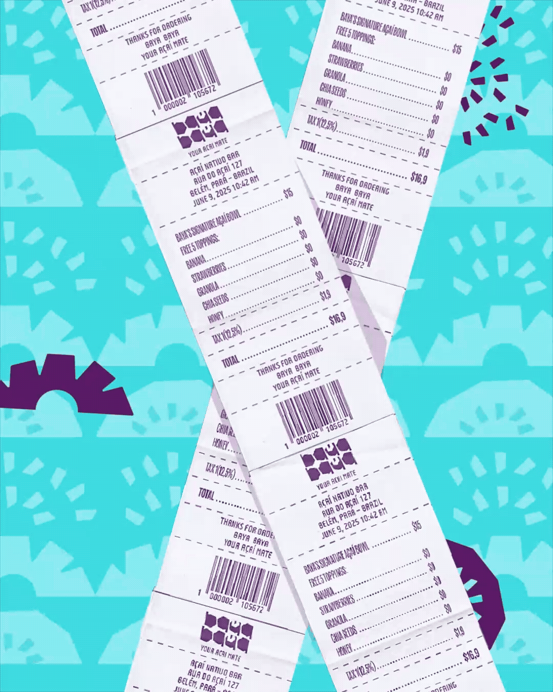
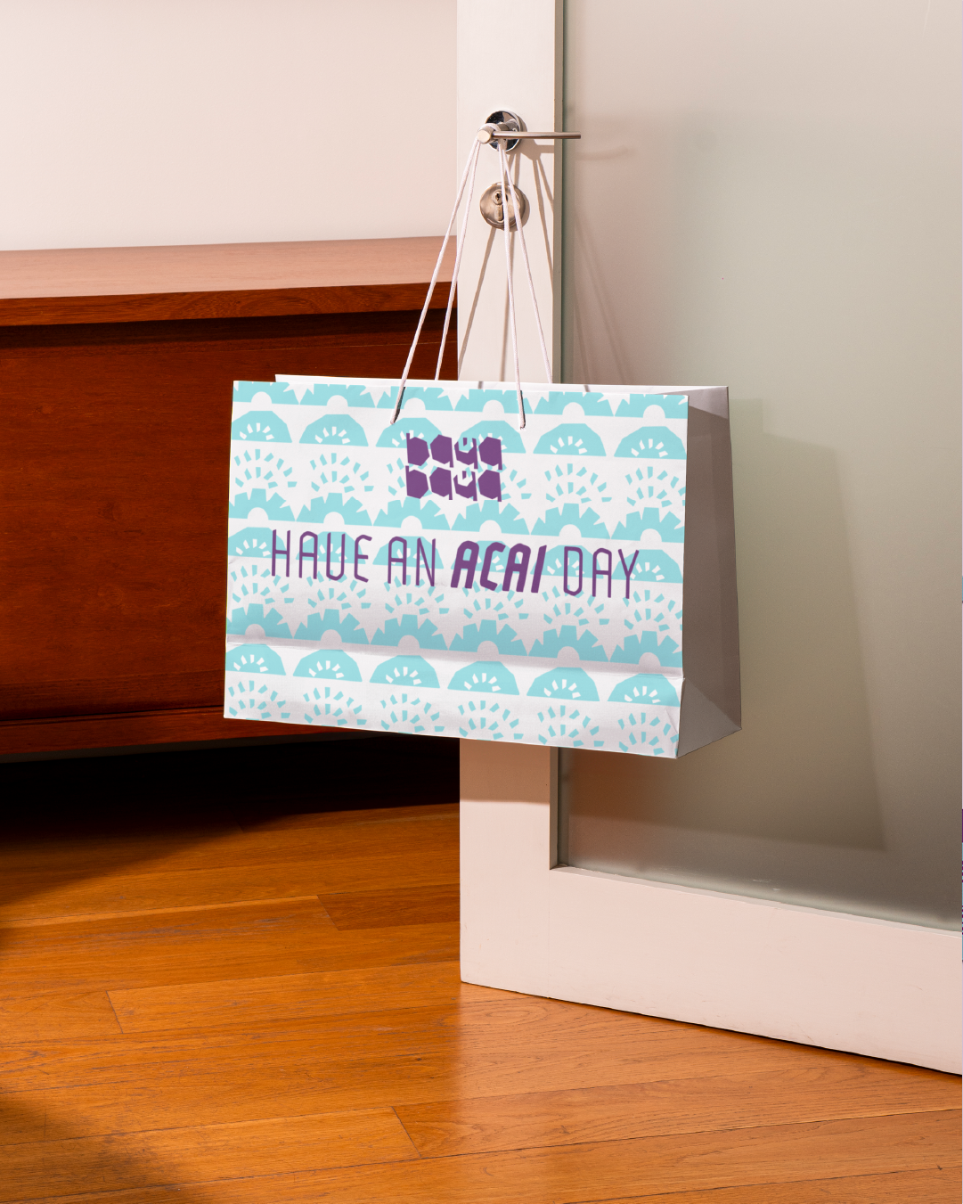
As a tropical day buddy, Baya-Baya unalterable commitments on environment sustainability are comprehensively reflected on its eco-friendly packaging material. One of its method is to reduce plastic use as minimal as possible, leaving no trace for waste. This way of leveraging itself as the perfect choice for health and environmentally-conscious individuals.
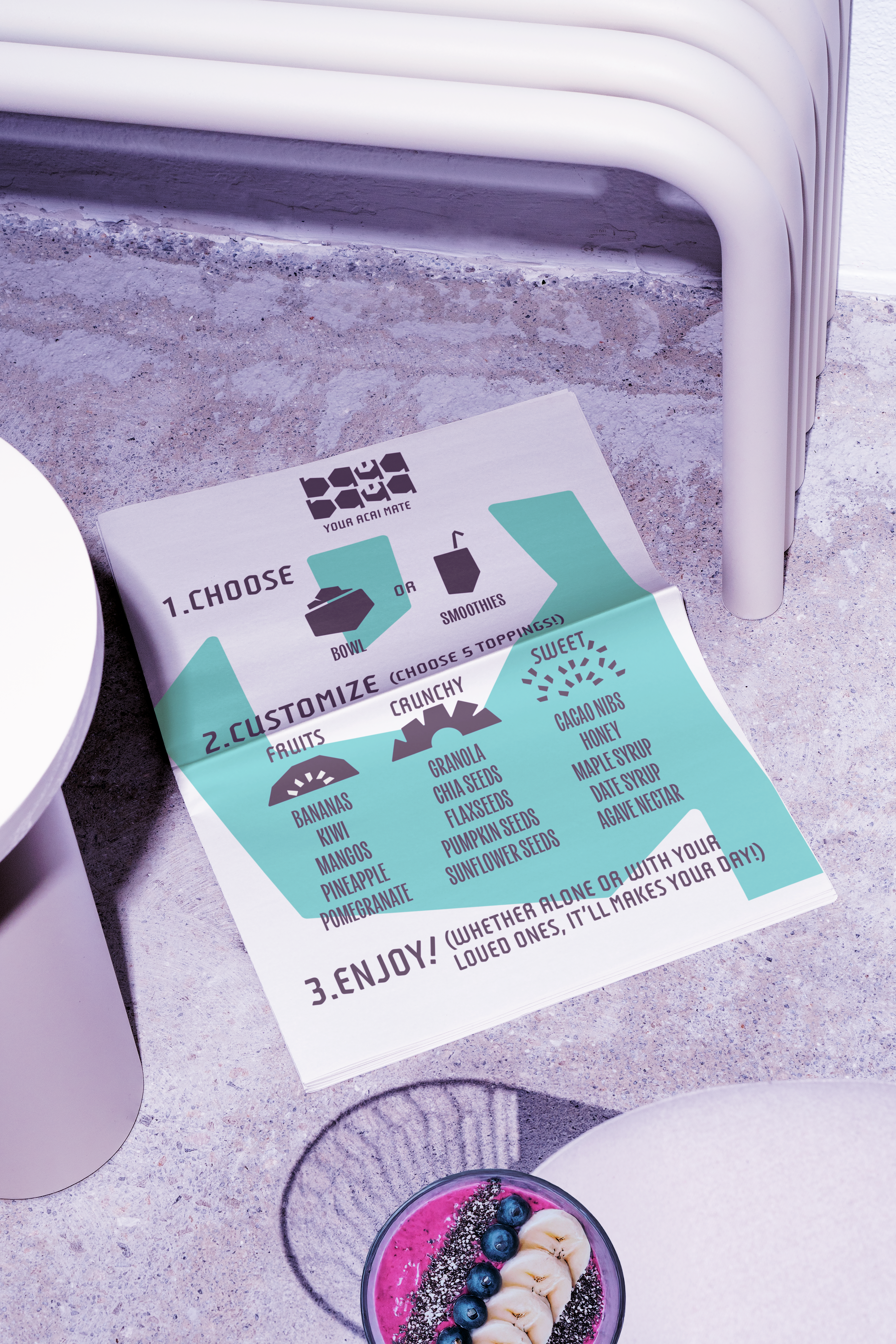
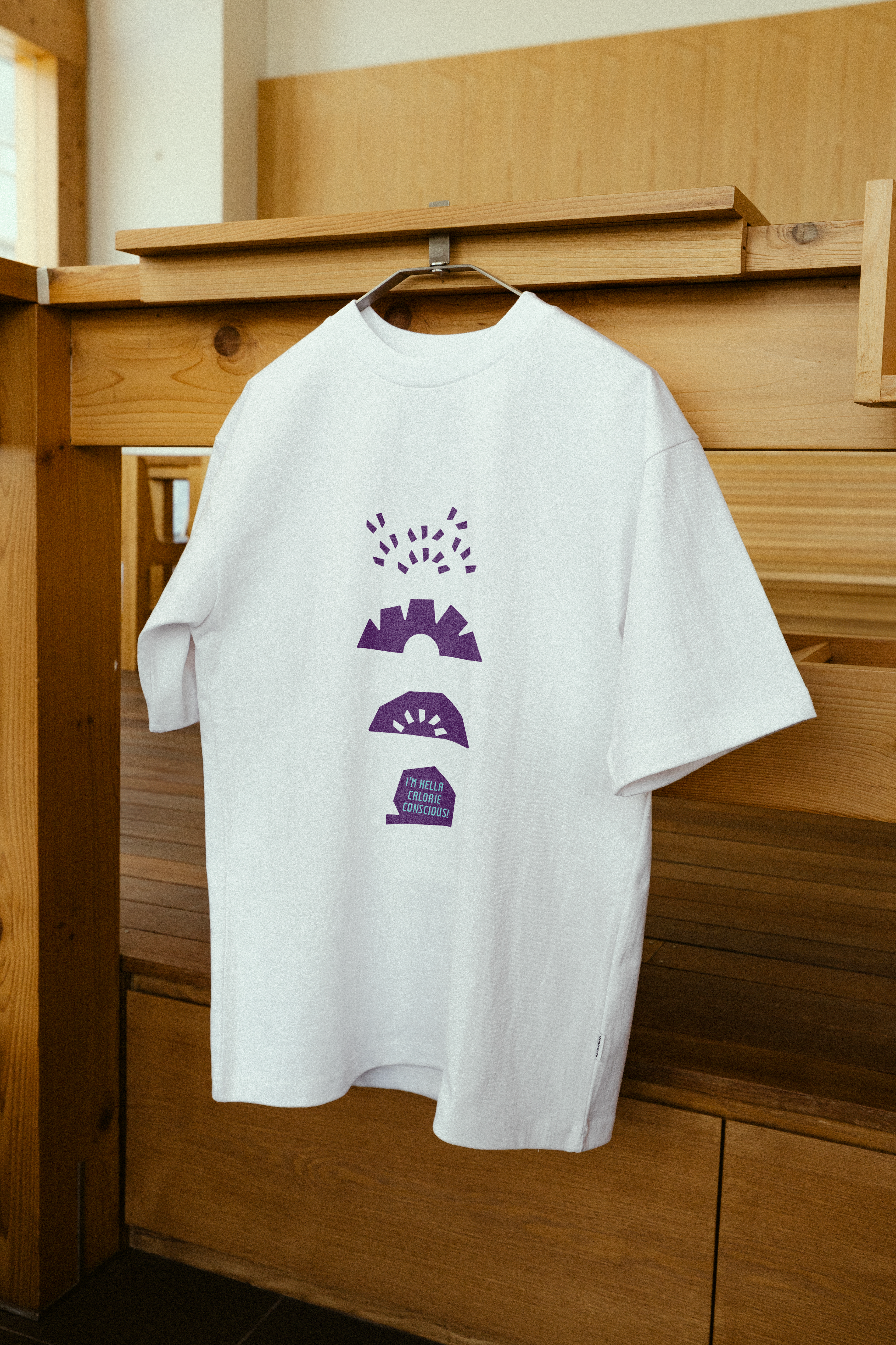
Utilizing supergraphics usage, including pattern, icons, and illustrations ensuring cohesivity on various mediums. Referencing main logo - sharp yet rounded pointy corner that reflects precision and natural ingredients, are Açaí topping in form of illustrations implemented on menu to merch designs - or compiled into patterns. To communicate trendy slangs efficiently, using text box that are directly taken from logotype, making it a unique yet effective choice. Moreover, bold and bright, tilted thunder-alike icons functions as background or even headline container on poster or stationeries.
AT LAST, HAVE AN ACAI DAY!
Baya-Baya unique approach of relating to young audiences and concurrently commiting to fresh ingredients making it a go-to place for tropical day getaway. Highlighting pure ingredients throughout its identity, seen through mindful choice from colors to illustrations. The results are cohesively built healthy-oriented Açaí brand. And yes, the vibes are always right - as they would say "Have An Açaí Day!".