BUILT FOR THE GRIND. NOT THE GLAM
Pace+ is skincare made for athletes and active days. It protects your body and skin from sweat, sun, and whatever else your workout throws at you. The products are effective and keep your skin ready to train, recover, and do it all again.
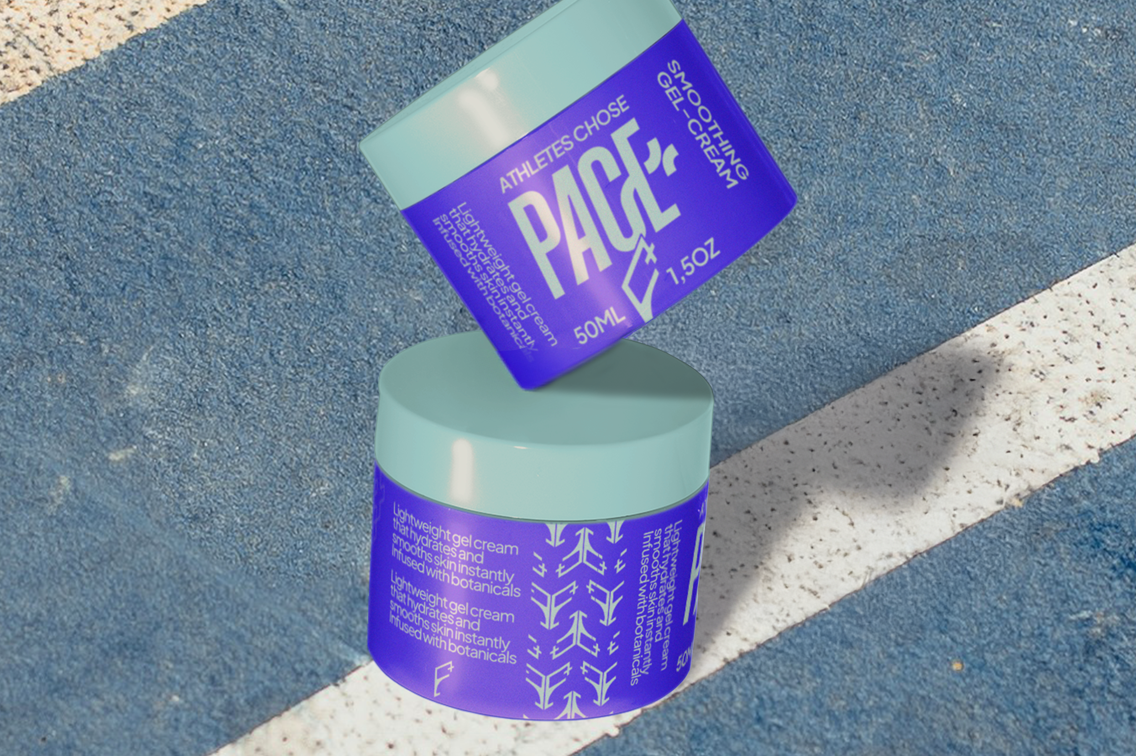
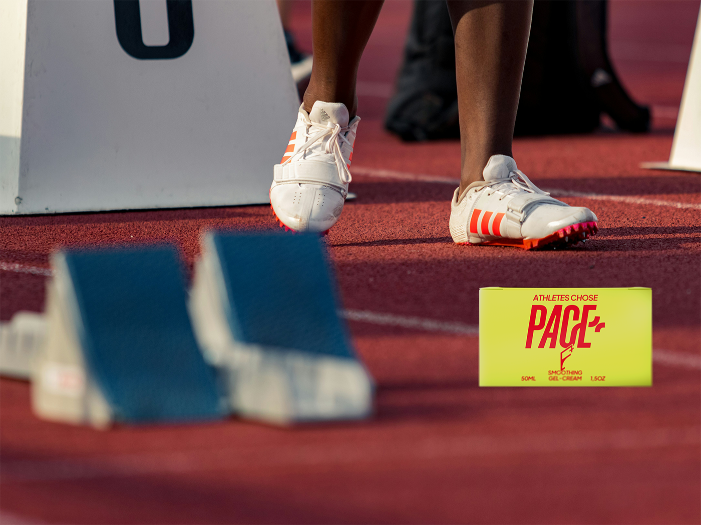
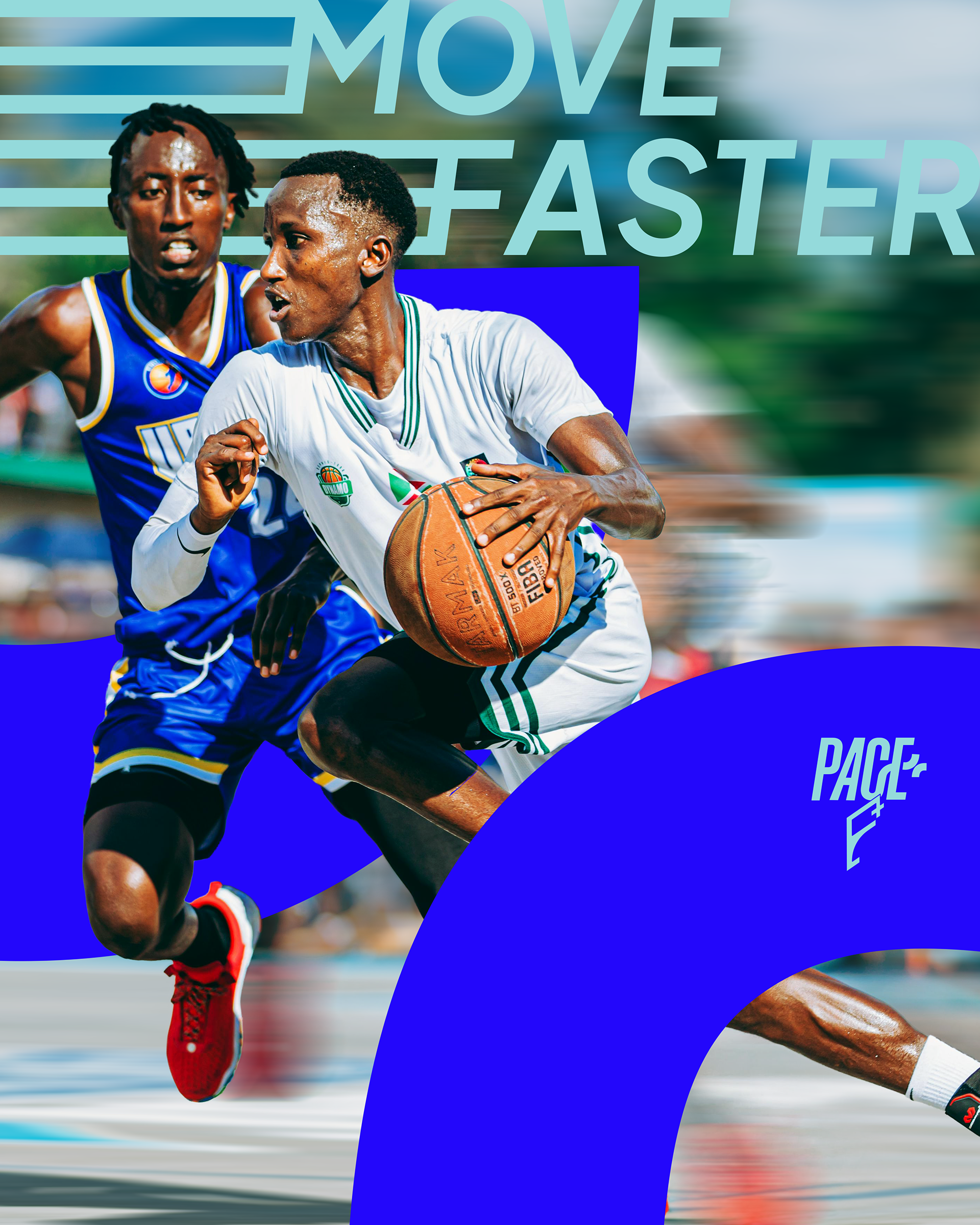
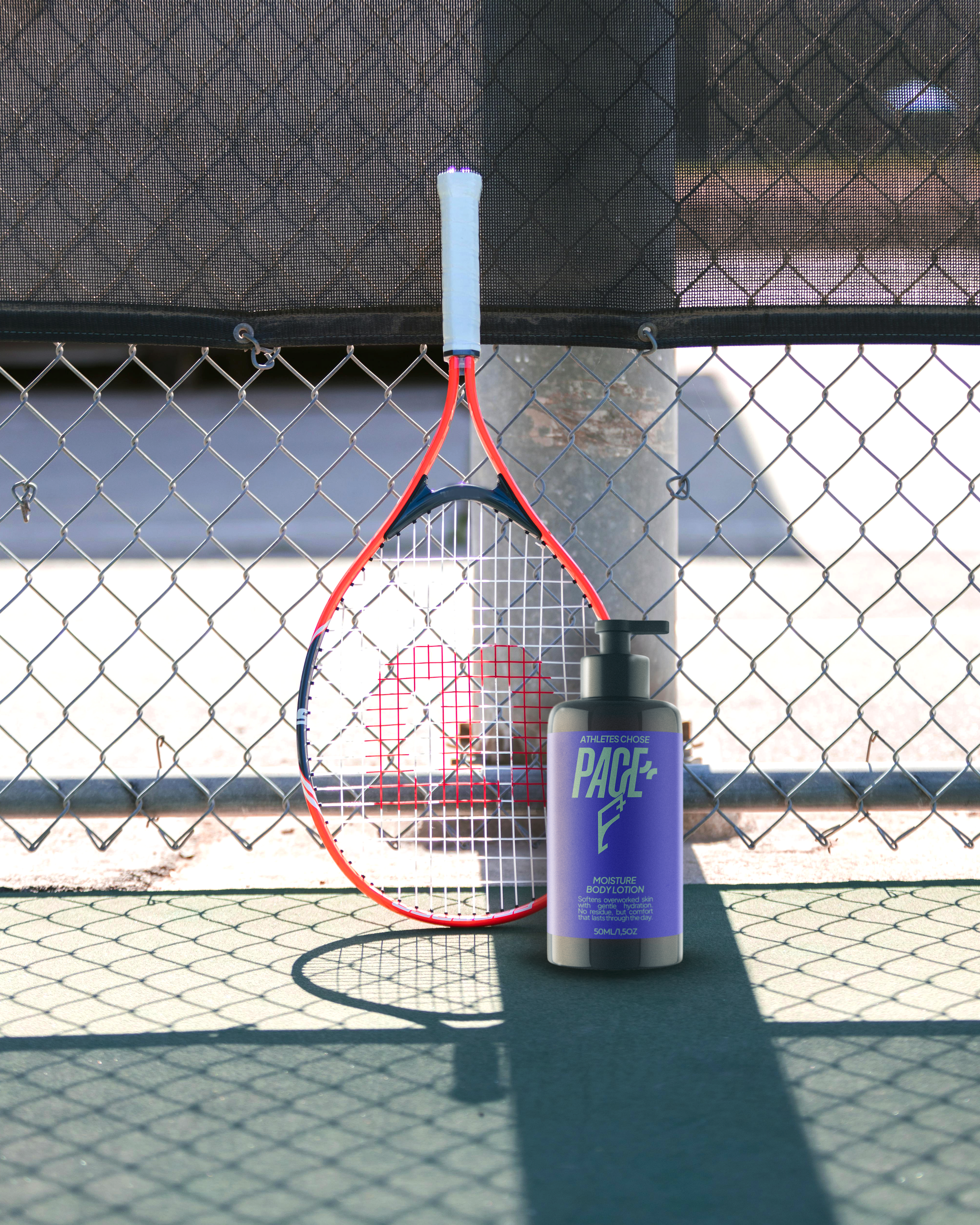
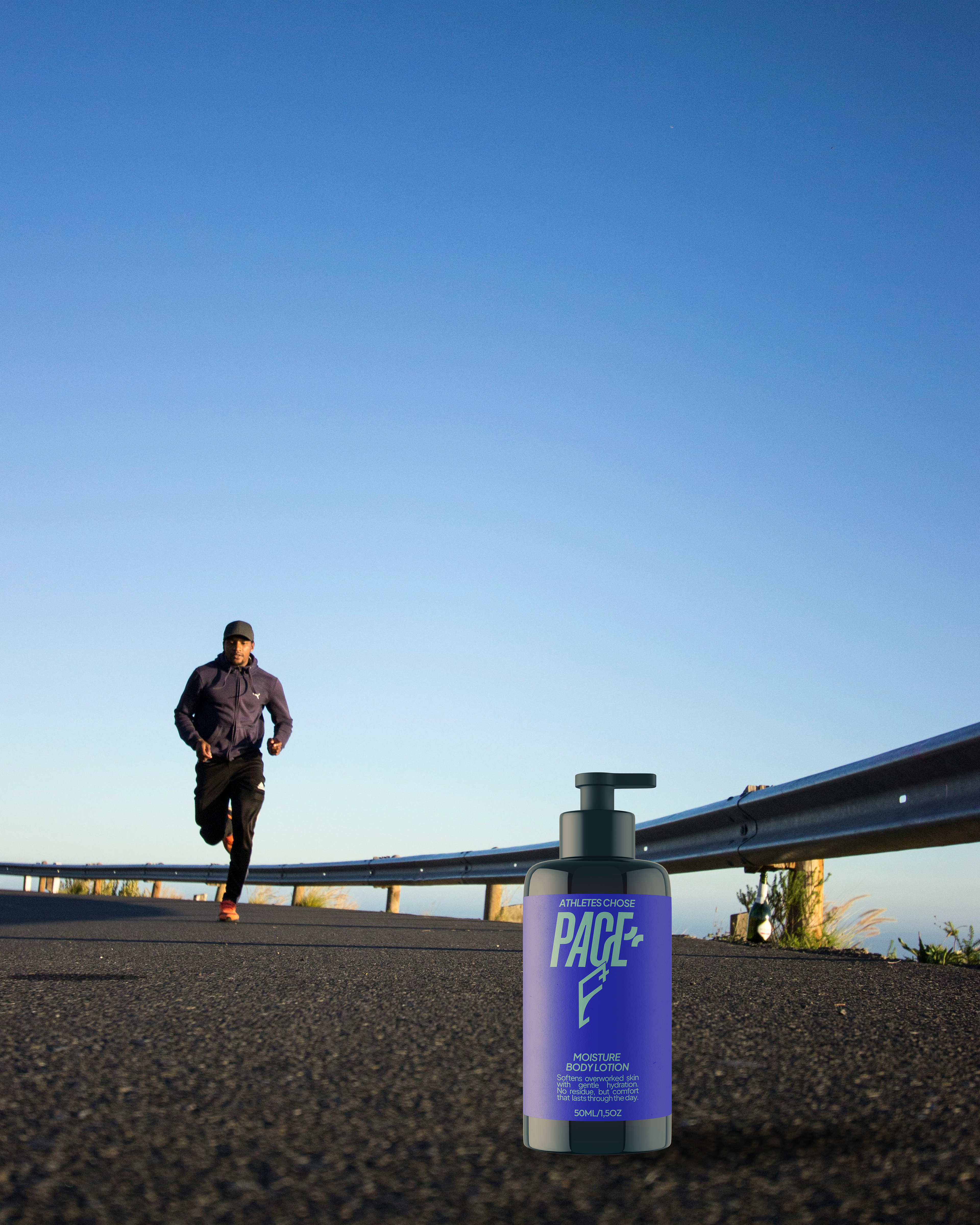
Unlike vast majority of Athletes Skincare brand, Pace+ takes a whole level of earnestness, reflecting its commitment of serving athletes from start to finish, and repeat. To earn more credibility, the photography directions are centered on real athletes in-game performance on various sports (think of basketball, tennis, or even skateboard and many others) - not using fake composition with models that will decrease the overall brand’s authenticity. Post-editing include adding velocity effects to further show their fast pace. The same approach with skincare products shot not on fancy studio, but in outdoor with natural lighting, not only aligns as an effective skincare choice for athletes - more than that, it became a reflection of packaging durability that support their active days.

MORE THAN JUST A FINISH LINE
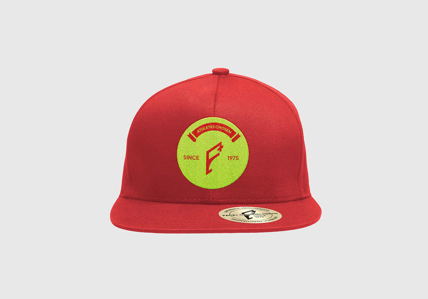
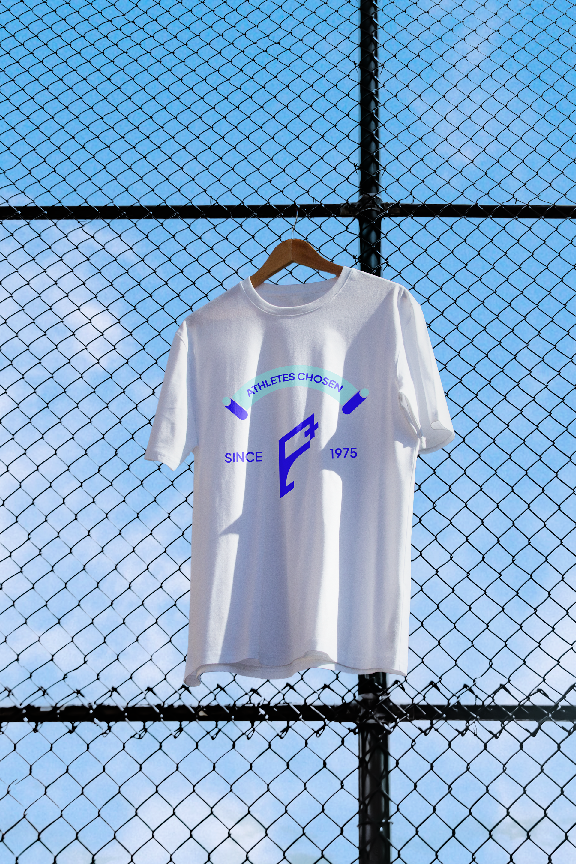
Takes inspiration from the checkered flag pattern often use to indicate end of the race. On a superficial level, it reflects the boldness, spirit, and accomplishment of athletes. But more thoroughly, a tangible reminder of consistent dedication and determination of athletes being able to reach this point. It takes inspiration from the main logo, intended to be use flexibly across various medias, such as product packaging, or even social media posts background.
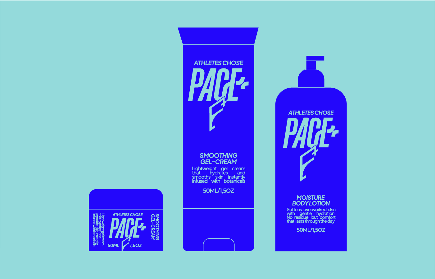
Logomark used bold italicized sans-serif to capture more dynamic movement of athletes - Moreover, it features bespoke interwoven letters between letter “C” and “E”, hence crossbar of letter “E” creating a seamless plus symbol. For the primary and secondary typefaces, it features minimal yet sharp sans-serif ensuring the alignment with its contemporary approach to skincare.

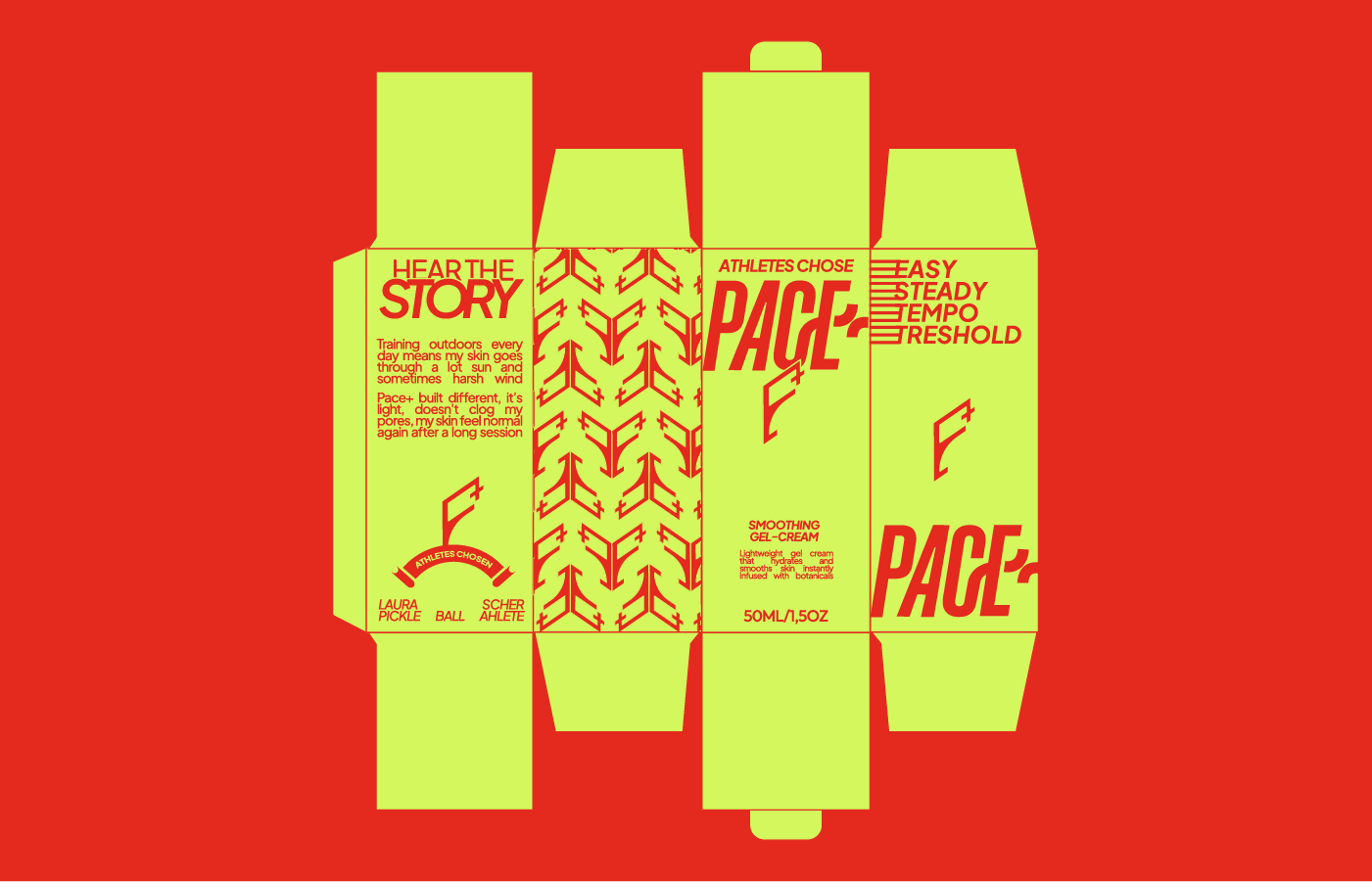
SKINCARE DESIGNED TO DOMINATE
Combining lively bold and vibrant color to symbolize high competitive energy, with emphasis on incorporating primary colors (red, yellow, and blue) - a fusion of high saturated colors evoke sense of enthusiasm on viewer’s eye. Further, when applied to packaging by using only two high contrast colors at a time, it invokes an in-depth reflection of athletes’ focus and dedication.